ROMANCE COVERS AT A GLANCE
Covers in the Romance genre are about kissing, cuddling, touching, roses, satin sheets, cream, strawaberries and pearls. Men and women are drop-dead gorgeous and the settings, perfect. As if we’ve suddenly made it to a bright-colored heaven created with the latest computer technology.
Remember, the cover of a book has to stir emotion. In romance, perhaps even more than in other genres. A quick glance should be enough the swipe the reader off her feet, transport her in that torrid love-story she never had. Yet :). Sounds easy? Better not jump to conclusions.
“Given that sameness, here’s the challenge: each cover must distinguish itself from the competition, both in-house and across publishers, while fitting in with a particular brand or series aesthetic—all while reassuring readers that they’re going to get the love story that they expect,” writes Publisher’s Weekly.
Bear in mind that the whole sex sells thing is overrated. In contemporaries, paranormal, and romantic suspense, solo men work better than a couple entanglend on the beach. According to an article posted on romanceauthormarketingnetwork.com, men are on 57% of the covers of best-selling books, followed at a distance by couples (at only 25%). The male on the cover will be more appealing to the audience if he is shirtless and has t he abs of a fitness instructor.
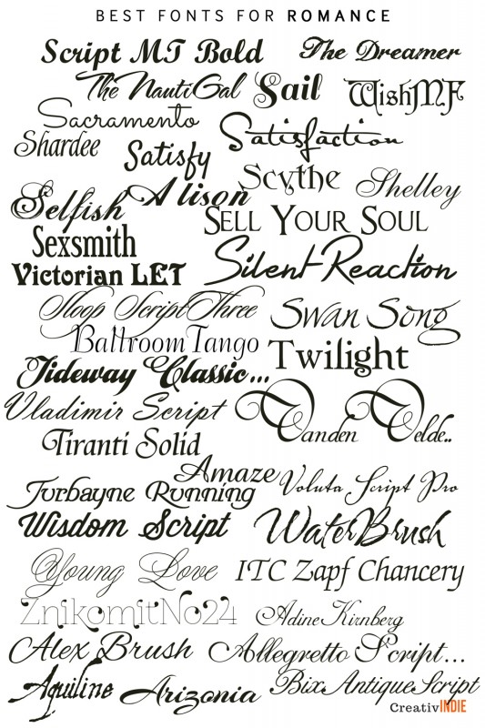
If you are writing a series – which you should to generate sales, you need a consistent approach – same fonts used for your author name and the title, but not the same color palette. The colours should be bright with blue being as successful and common as shirtless men. The author name should always be big, otherwise readers will get the message you are not very important. Pay attention to the fonts. You will notice that romance books covers use a certain type that sometimes resembles handwriting. Use one decorative font and keep the others simple.
The most important thing about your book cover is the picture. Make sure to use a copyright-free one or own/ pay for the copyright. Download the high-resolution version. Although covers appear as thumbnails on Amazon, you want it to look perfect in print. Just like traditionally published books. Don’t cover the picture up with the text. Make the text blend in with the image as one art piece.
“A cover needs to fit with its genre and be visually attractive. That is more important than having lots of details to accurately illustrate scenes from the story,” recommends Melody Simmons.
If you are looking for best-value, good quality Romance cover design services, you might want to check our special offer.


